Polimi app
Starting from a first phase of analysis of Politecnico di Milano current app, used daily by thousands of students but with usability problems that persist since its birth, it has been completely redesigned starting from its information architecture to the interface, alongside the official redesign work carried out by Tangity.

Design duration: 1 month and 3 weeks

Main project team: 4 UX/UI Designer (Ludovica Bonaldo, Giulia Gobetti, Francesca Macolino, Luca Meneguzzo)

Skills used: Wireframes, UX design, UI design, UX research, Prototyping

Tools: Figma, Miro, Maze, Illustrator

Employer: Politecnico di Milano
From analysis to makeover
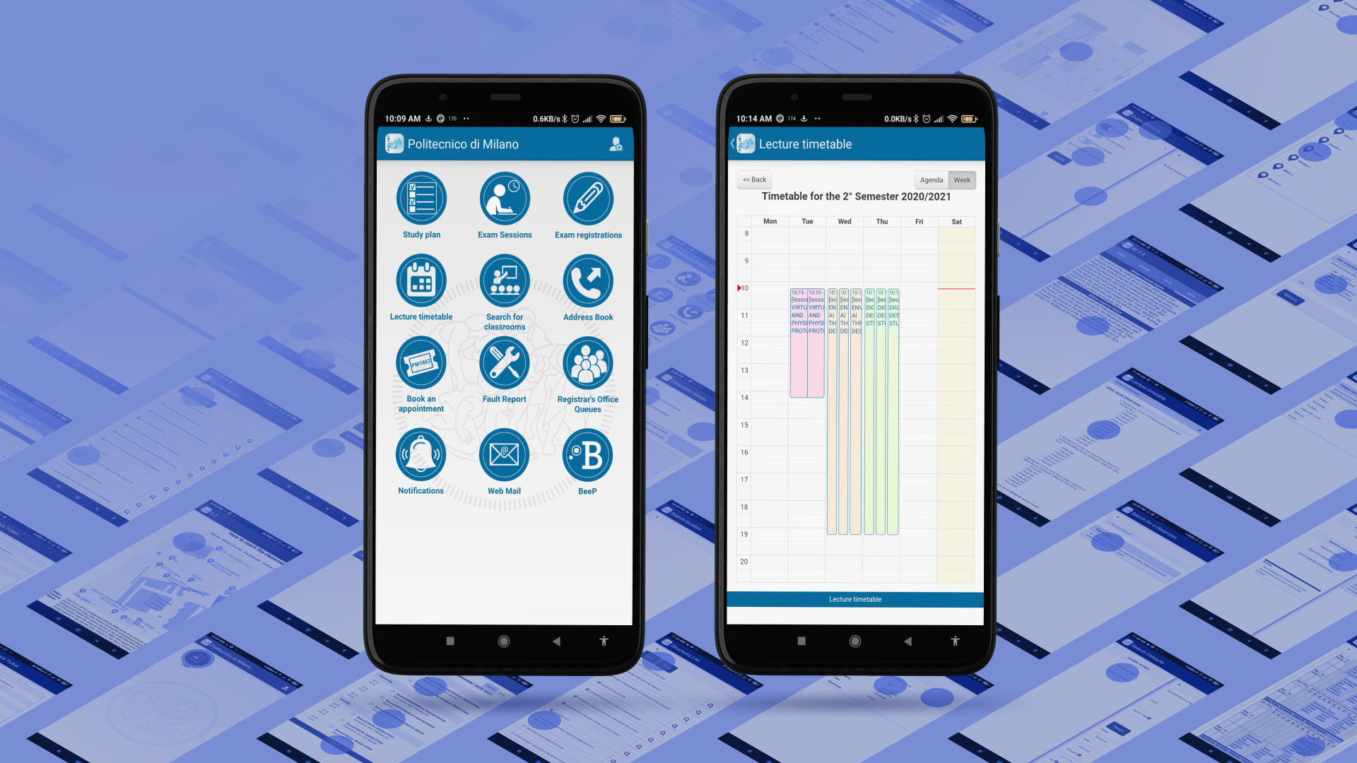
The proposed brief was very simple: the analysis of the app available to students and professors to access university online services and, based on this, create a consistent redesign on the problems found. It was not necessary to keep all the content present. On the contrary, the advice was to simplify as much as possible and keep the essentials that were actually useful to users.

Project roadmap
The activities organized during the development of the project were numerous, especially due to the tight schedule imposed by the course. Despite this, we wanted to do usability testing every week or so while designing the interface to make sure we were as adherent as possible to the users’ needs and to solve all problems in the most effective way.

App analysis
The first among these steps was a quick initial analysis to identify the content inside, collect all the screens present and identify the possible scenarios in which students use the app more (compared for example to the counterpart with more content and services on the website). Next, we performed an evaluation heuristic by scoring on the same collected screenshots all the issues, giving a severity score, and referencing Jackob Nielsen’s ten usability heuristics.
UX research activities
The heuristic evaluation resulted in the identification of more than 122 problems from a total of 67 screens, with an average severity of 3.1 out of 5. The following usability test also led to rather disappointing results, confirming the problems found earlier. For the next two usability tests, carried out on the redesing, the same scenarios and tasks were used, so that the results could be compared.

Information architecture
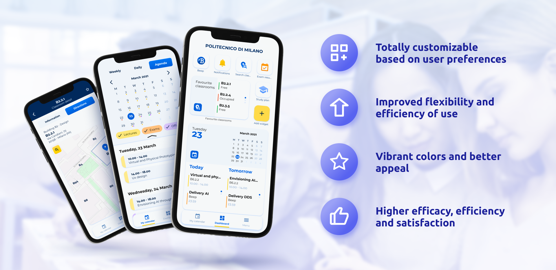
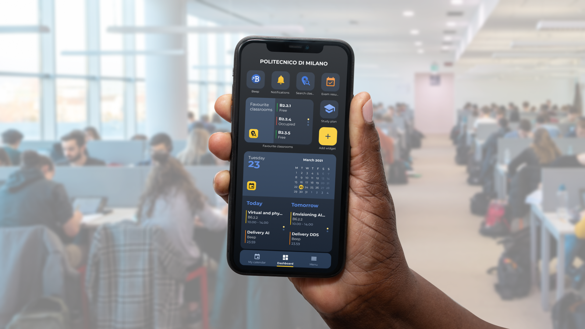
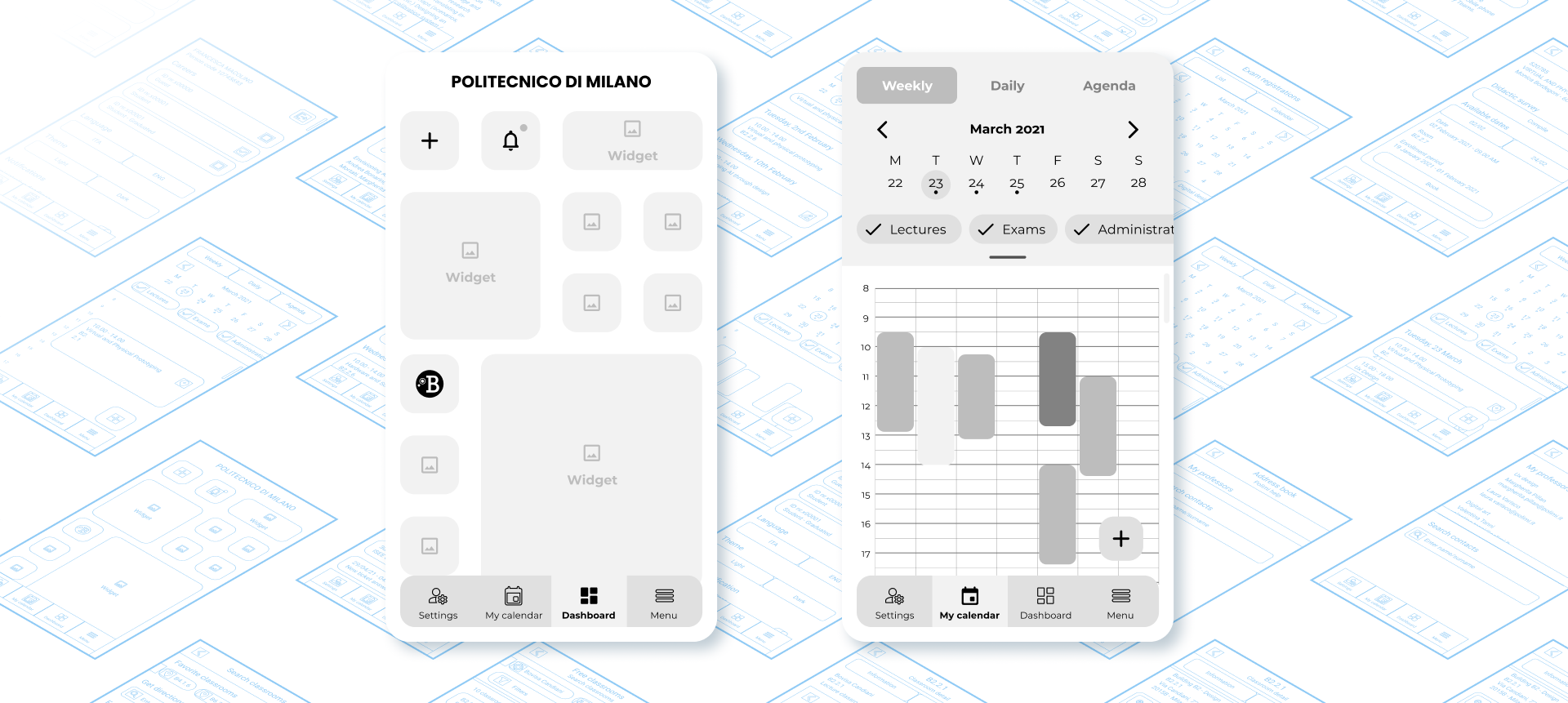
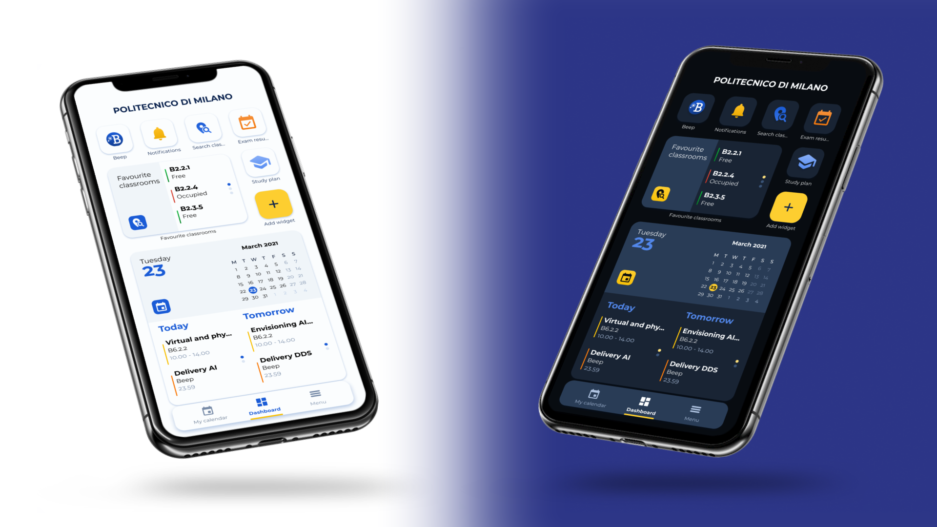
In order to structure the new app, starting from the architecture of the information, a card sorting was carried out with students, to identify the contents they considered necessary in their university life, and their possible location. After several iterations, a dashboard-based structure was chosen, which can be accessed using a navigation bar that contains also the menu and calendar. An emphasis was placed on minimizing depth levels so that it is easily navigable, adding several shortcuts.

Wireframe
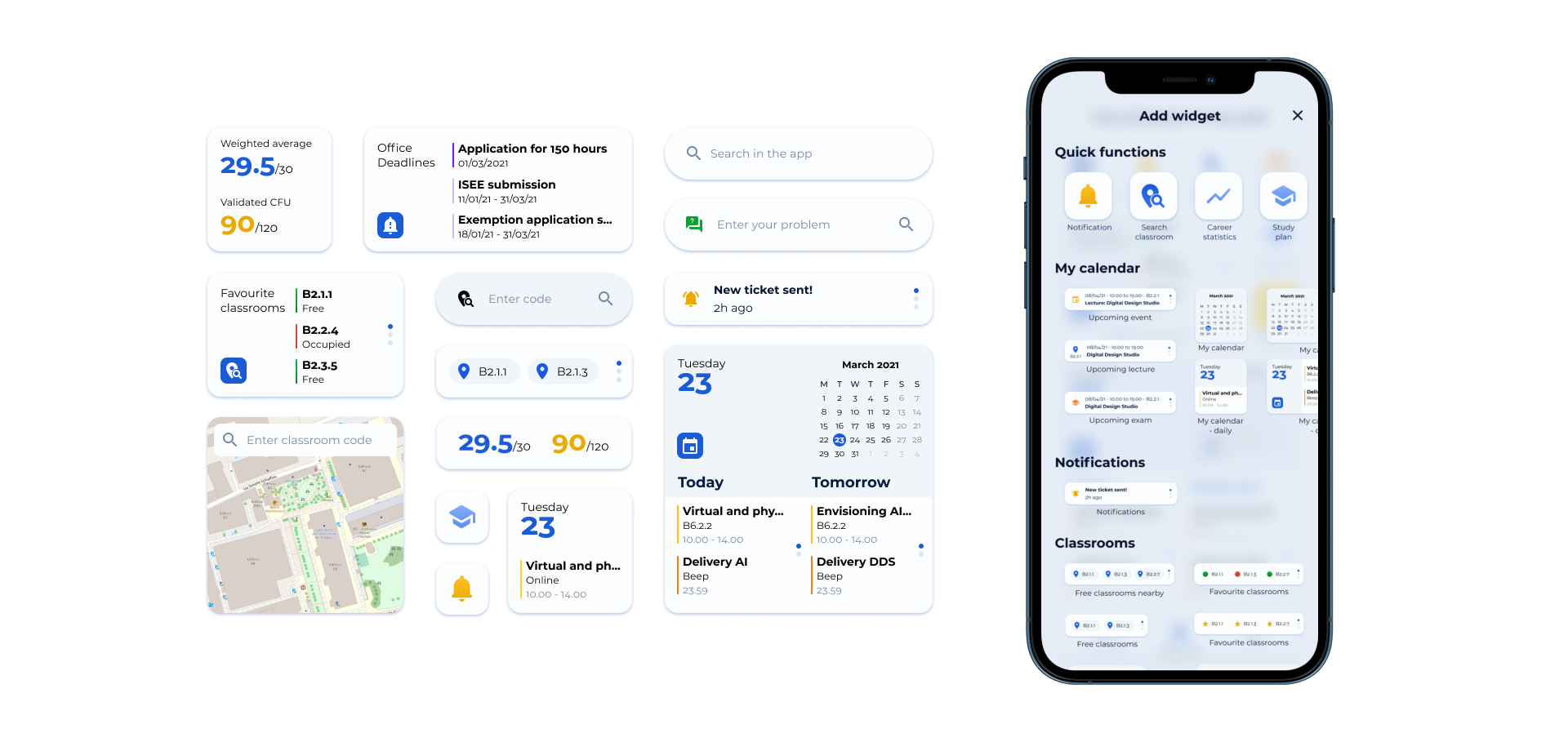
After defining the information architecture, we moved on to creating the wireframe. We preferred to stick to elements that were as familiar as possible, to make interaction simple. For the dashboard we created a grid where widgets of various sizes are placed, which you can customize to meet your needs, sticking very much to the same experience you currently have in the home of iOS and Android operating systems.
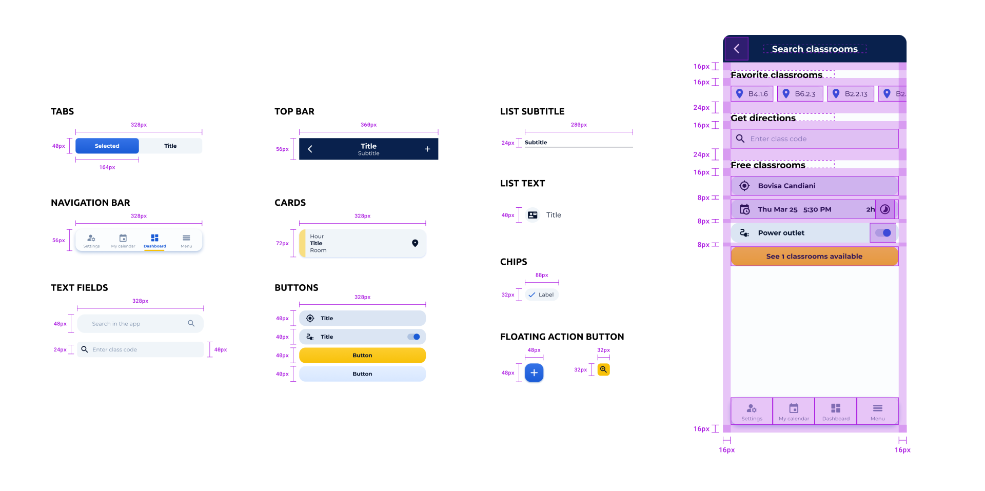
UI elements & composition
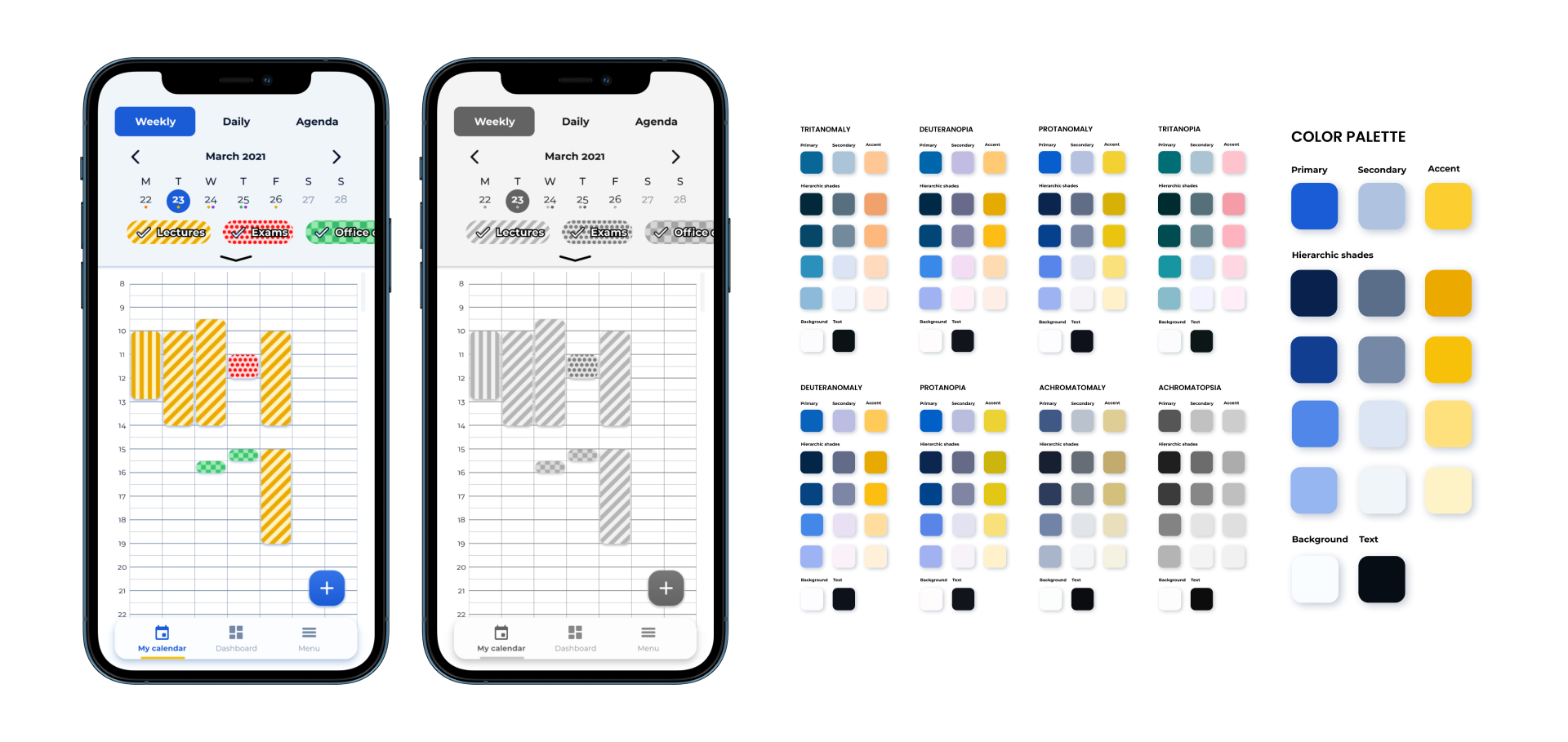
For the graphics, we chose a palette that was close to the official colors of the corporate image of the Politecnico di Milano, choosing yellow as the accent color. The graphic elements and their placement within the screen are based on a grid of 8x8 px. A recurring element are the chips, exploited for searches and content filtering, as in the search for classrooms or in the calendar.
Light & Dark mode
The project extended far beyond the realization of the classic light mode, creating also the dark version. This is to meet the recent trends that indicate the dark mode as the preferred one, to reduce battery consumption and not to overstress the eyes.
A complete set of functions
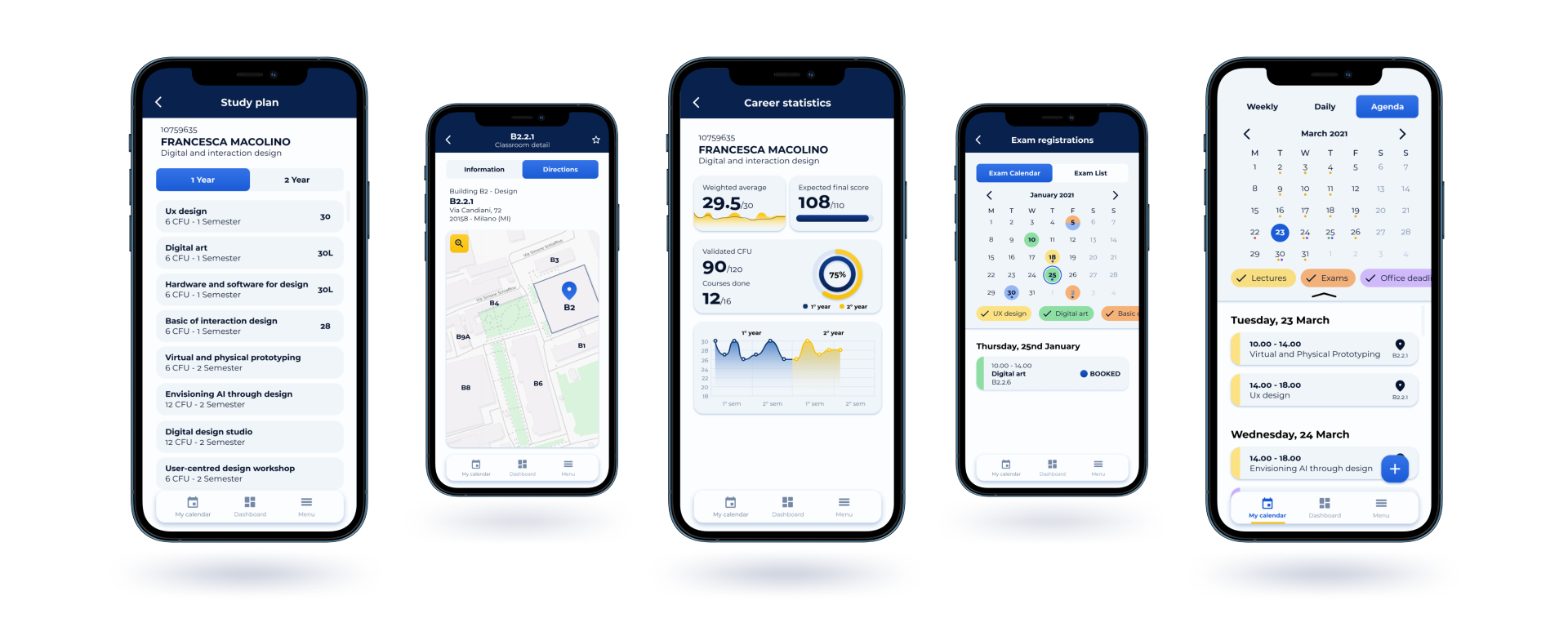
The functions implemented all meet the daily needs of students. As on the website, the student can check their schedule, exams and appointments set, also synchronizing with their accounts and adding new events. They can check their progress, exams passed and register for new ones. The functions eliminated are fault report, which from the tests was not used at all, and the address book, whose contacts have been inserted directly in the details of each course.
Plenty of widgets
The heart of the redesign is the dashboard. In this screen you can add a varied set of widgets that, in addition to giving a preview of the content of the sections, act as shortcuts to the content itself. In this way the time to reach one’ s goal is greatly reduced, improving the user experience.
Study of accessibility
We had the opportunity to perform a usability testing of the old app with a color blind student, giving us a great motivation to design for all user groups, even those with visual impairments. From the app settings it’s possible to change the display of colors in the calendar and other sections into patterns, since they are used to differentiate events and elements of different types.
Additional material
You can check out the entire design process in more detail and explore the full prototype of the app with light and dark mode. If you need more information, you can always contact me.
Strenght points
The strengths of this redesign are many. When comparing the experience with the previous app and the respective satisfaction ratings of the testers, there is a high level of satisfaction with the implemented changes. The app allows for great customization, tailored to the needs of each user who uses it, saving time and greatly reducing stress during use.
- Totally customizable based on user preferences
- Improved flexibility and efficiency of use
- Vibrant colors and better appeal
- Higher efficacy, efficiency and satisfaction