Hostettler eCommerce
hostettler is a company that imports and sells motorbikes, bicycles, equipment and clothing and is the official dealer of Yamaha products in Switzerland.
The company wanted to digitize the purchasing process of their products by offering Swiss customers a seamless experience by linking to Yamaha’s official ecommerce, which until then had only been done locally at their authorised dealers and not online.

Design duration: 1.5 months

Main project team: 1 Project manager, 1 UX Lead, 1 UX/UI Designer, Salesforce team (3-4 developers, 2 functional analyst)

Skills used: Wireframes, UX design, UI design, UX writing, Design System management

Tools: Figma

Employer: PwC
Project challenges
Although at first glance it may appear to be an easy project to manage and complete, the reality faced raised many challenges.
Visual coherence
The design had to be consistent with the Yamaha ecommerce from where the user was redirected, but Yamaha itself was developing a rebranding of the site. It was therefore necessary to develop a solution that did not interrupt the user experience and maintained consistency during the rerouting to the hostettler checkout.
Unfortunately, the documentation sent by Yamaha on the new brand identity and ecommerce was very limited, as it had not yet been fully developed, making it even more difficult to design the screens.
hostettler’s brand image
Although the brand image between Yamaha and hostettler is very similar, the customer wanted the interface to be more characterised and their brand to stand out more.
This request was in contrast to the visual consistency that had to be maintained during the redirection.
Build client trust
It was the first time the client-side project manager approached the world of UX design. He was quite skeptical of the proposals that were brought in and resisted them.
He brought in references and graphic ideas from other ecommerce shops with completely different targets and products, making it difficult to satisfy him.
Information architecture
The organizational structure of the screens consists of a single checkout flow, which varies slightly for a user not registered to the website, and a private area that branches into detail pages where the user can check the status of their orders and personal information.

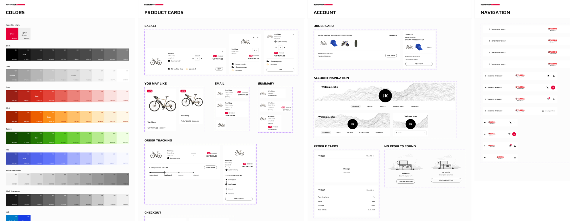
Design System
Given the large number of functions to be integrated in a very limited time, it was decided to use AGID’s Design System Italia as a starting point. This made it possible to keep aligned with the usability and accessibility standards defined by law and optimize design timeline.
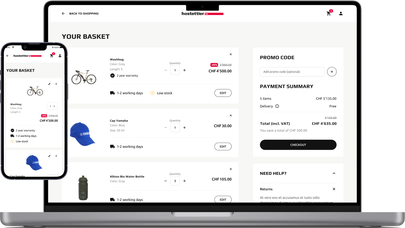
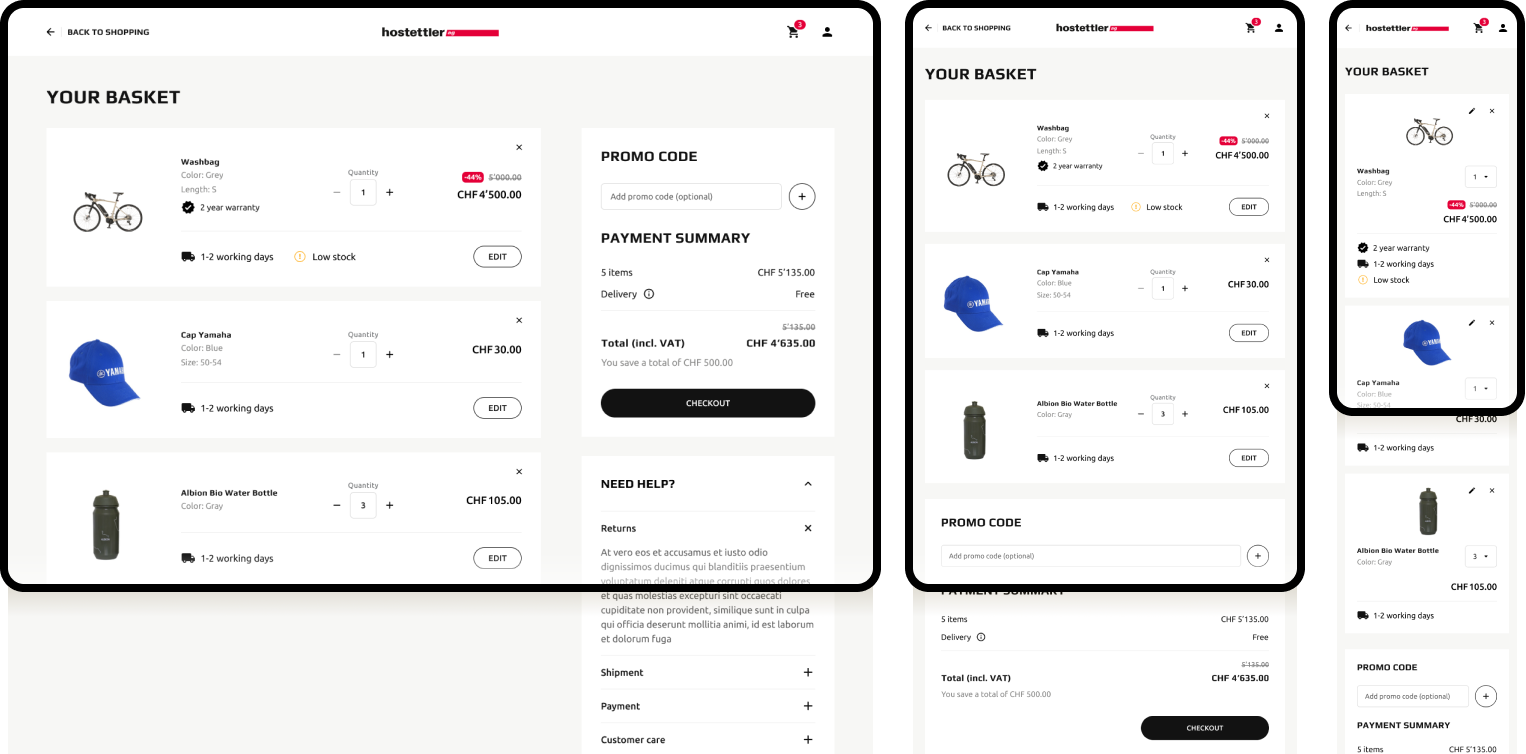
Your basket
This page is the landing point immediately after the redirection from the Yamaha ecommerce for all Swiss residents. It shows all the products placed in the cart so far, adding the time frames for delivery and the ability to add units without being redirected back to the Yamaha site. The design of this page was not easy because of many technical level restrictions in the type of implementation that was done on the development side.
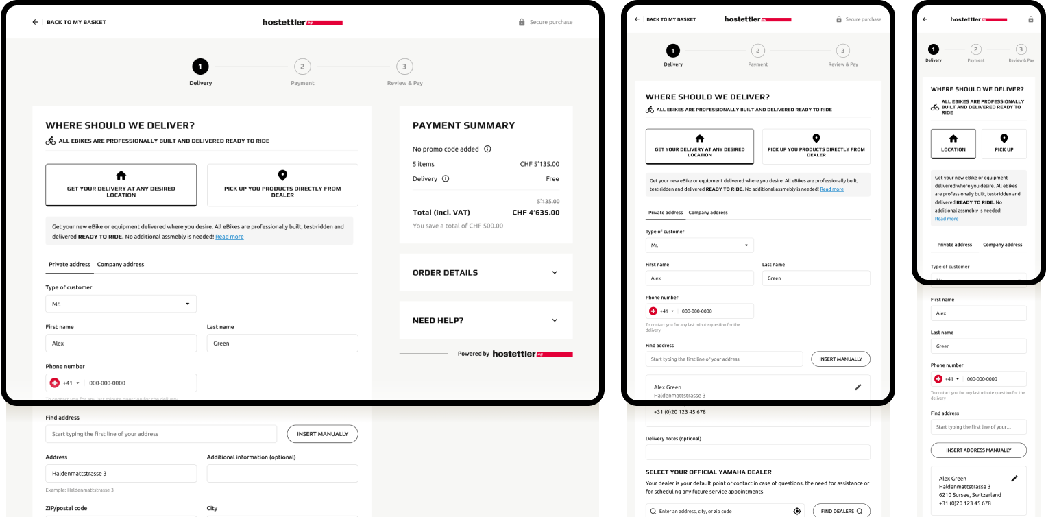
Checkout
In the checkout flow, the user enters all of their personal information, in case they do not have an account or are not logged in, and decides on the shipping method between home delivery or pickup at a hostettler dealer.
The flow then continues by entering the payment method and reviewing all the information to confirm its correctness and proceed with payment.
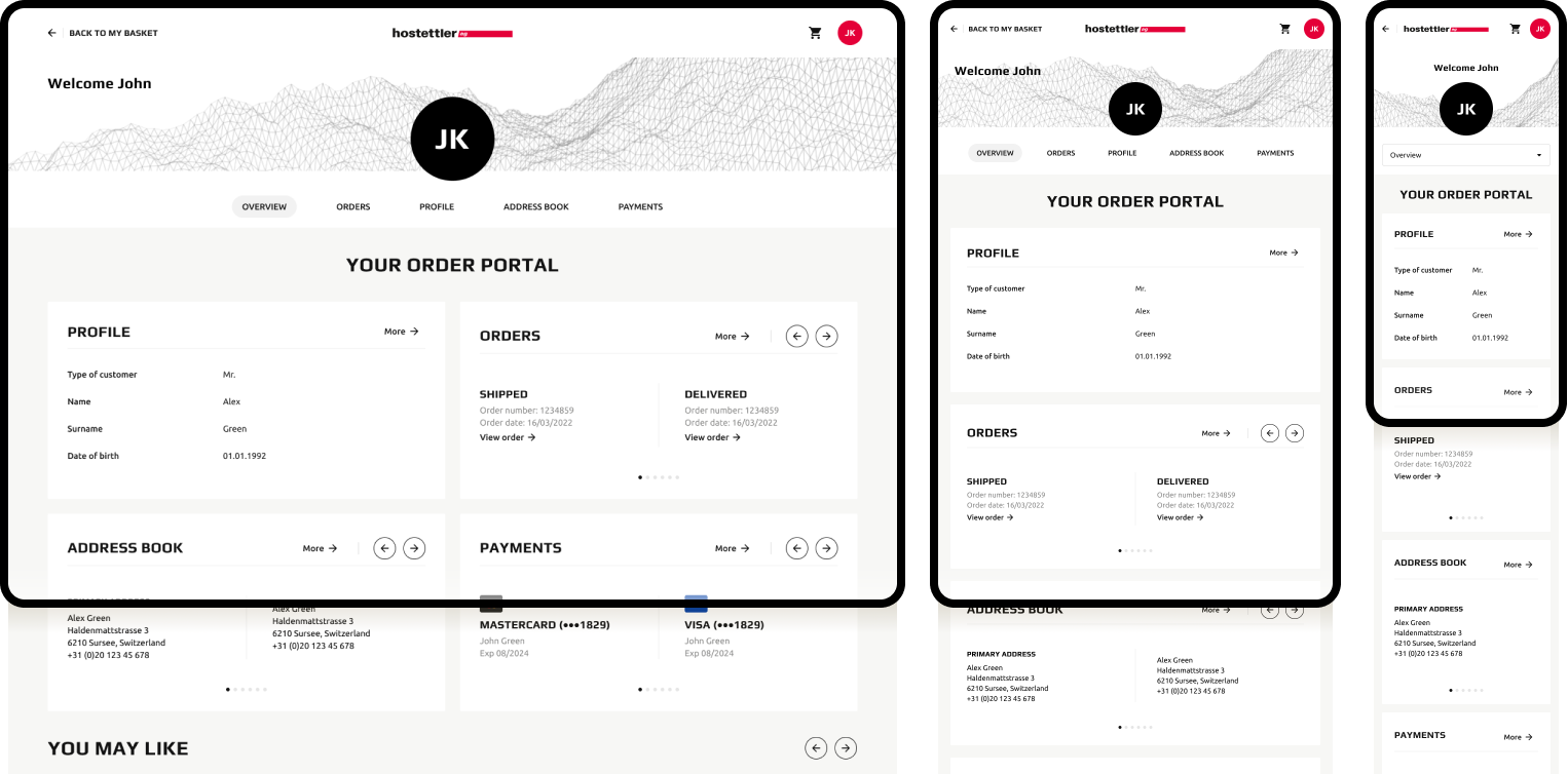
Account
In the account’s private area, the user can browse saved information such as delivery addresses, previously used payment methods, and personal information. If there are orders that have already been placed, it is possible to see their details on the dedicated page, where the status and expected delivery date is shown for each item in the order.