Lombardia Informa
Lombardia Informa is an application born from the Regione Lombardia’s need to communicate in a targeted and functional way with citizens, businesses, institutions and operators in the territory.
It is a multi-channel service that collects users’ contact data, profiles them by interest and creates communication tools tailored to them.

Design duration: 5 months

Main project team: Main project team: 1 UX Lead, 1 UX/UI Designer, 1 Art Director, Dev team

Skills used: Wireframing, UX designing, UI designing, 3D modeling

Tools: Mural, Figma

Employer: PwC
Project roadmap
The project was developed in two streams: in the first, lasted a total of 3 months, the focus was on the redesign, both graphically and structurally, of the website and app; in the second, lasted 2 months, on the ideation and integration of some gamification logics, with a new section entirely dedicated.
The overall concept development and goals of the sprints were based on extensive user research conducted in the previous months to determine possible areas of service expansion and enhancement.

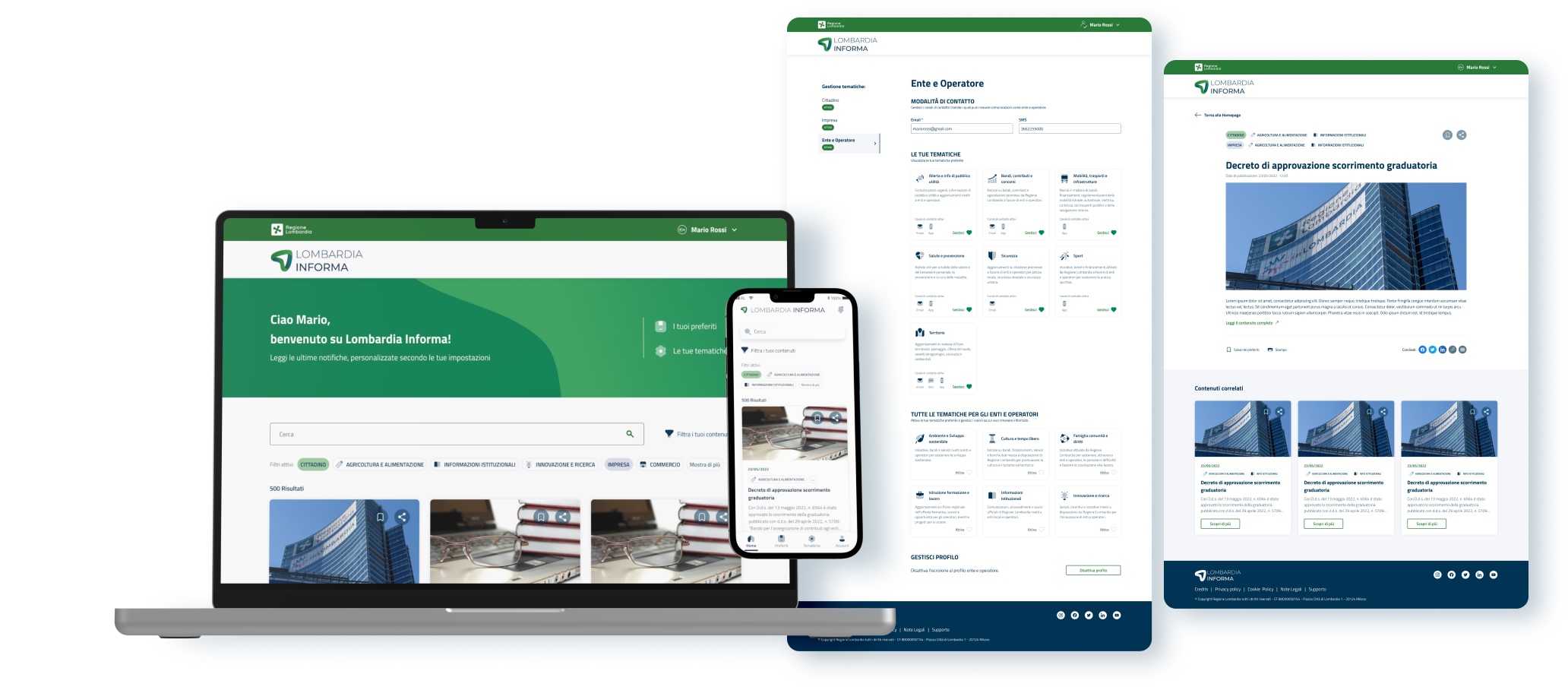
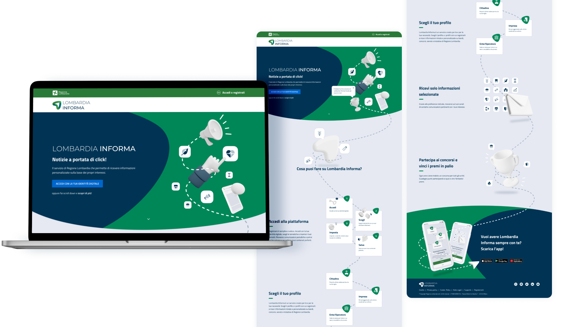
Information architecture - website
The information architecture of the website has two main focus screens: the landing page, which is visible to non-logged-in users and explains how the service works and how to sign in; and the homepage, visible only after logging in, where all published articles are collected and acts as a hub to all other features, including a contest section.

Information architecture - app
The information architecture of the app follows a similar logic to that of the website, taking the same content but adapting it to a navigation typical of smartphone applications. Compared to the website, settings have been added to set up faster login with the passcode and biometric authentication.

Branding & UI
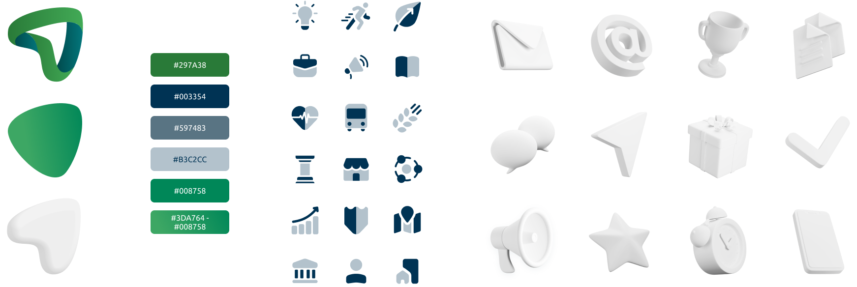
The design of the service’s new brand identity was key to giving a clear direction to the whole project. It was decided to give a fresher, younger look to the service, using flat solid shapes and 3d icons to play with dimensions and layers on the screen.
The palette was also revised, using a slightly cooler green than the official Regione Lombardia green that would better match the blue already present.
Landing page
The landing page was the main focus where the imagination was to be unleashed with the newly created brand identity. The goal was to make the service more appealing to a younger audience as well, giving it a less institutional look and more approachable look to the general population.
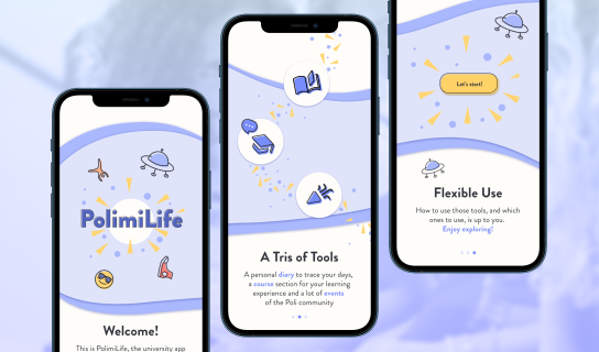
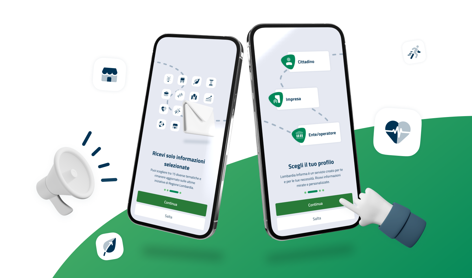
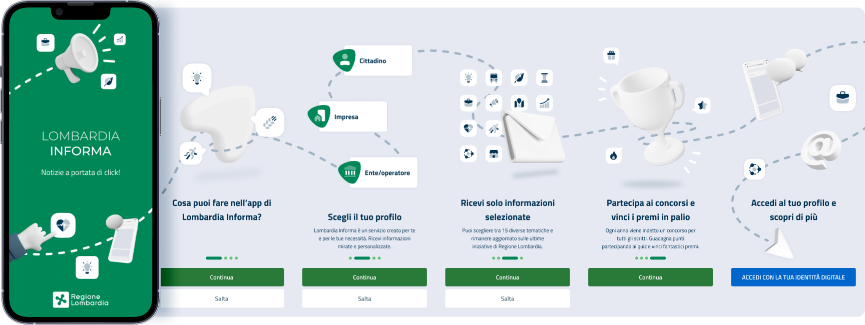
App onboarding
Even in the onboarding part of the app, which is visible on first access, a similar treatment was given to the landing page, so that there is a common thread between the different touchpoints. And it is precisely a thread, like on the website as well, that guides the user between screens, narrating what the service is all about and creating a path and visual storytelling.
News feed
The homepage, both on the site and in the app, is a news feed that collects all the articles and links that have been published and belonging to the topics that the user has selected. In this way, they can read only the content that they are interested in and can further explore by changing the filters.